An Examination of the Legacy and Archives of the Rainbow Bridge-Monument Valley Expedition, a book by Hans Baumann

This month, we hear from artist Hans Baumann who was commissioned by The ONWARD Project to research the archives of the Rainbow Bridge-Monument Valley Expedition, eventually binding the found knowledge into a single edition handmade art book.

This project – titled “An Examination of the Legacy and Archives of the Rainbow Bridge-Monument Valley Expedition” – is the culmination of an approximately 18-month period in 2019 and 2020 studying the archives of the Rainbow Bridge-Monument Valley Expedition (RBMVE). It was commissioned by The ONWARD Project, a nonprofit that (in their own words) “inspires new understandings of history and place in the American Southwest.”

In addition to the material held by The ONWARD Project, I had the opportunity to visit the RBMVE archives at UCLA, as well as archaeological sites in Tsegi Canyon – specifically Bat Woman House and Twin Caves.

The project is structured around my interactions with these data and places in the present day, and I use the format of a handmade art book to attempt to contextualize the legacy of the Expedition from my (contemporary) perspective as an artist with a deep interest in the land.

In an attempt to make this document of interest to the specialist, I include transcribed interviews with various academics, archaeologists and media specialists and use our exchanges to guide my historical inquiry.

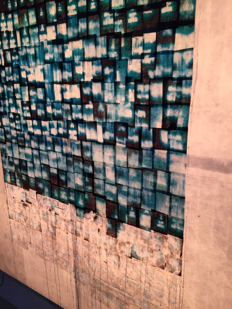
All materials for this project – paper, inks, binding, clay – are archival quality. This was my initial criteria for any material selection, as it is critical that this book be durable and have a viable trajectory (as an object) into the future. It is intended to communicate with generations beyond our own. Beyond this, I wanted the book to evoke the subject matter that it addresses.

Not only did I want it to feel “of” the archive, I wanted it to combine the colors and textures of Tsegi Canyon, as well as the grand transit of time that the book’s text addresses. The book’s enclosure is a ceramic slipcase and I went through an extended process of experimenting with various additives and finishes such that the ceramic feels somewhere between red Navajo sandstone and the many fractured and eroded potsherds found throughout the Canyon.

The book is bound in a post and screw style with nickel hardware and uses an undyed, half linen, half cotton book cloth, and the endsheets use an Amate paper made by Otomi craftsmen in Central Mexico.

detail of Amate paper (pinto)
sheep’s wool drying in the Tsegi Canyon

This paper was chosen because its ivory and walnut tones call to mind the stacks of undyed sheep’s wool that can be seen drying on racks outside homes in Tsegi Canyon. This is a very specific and personal memory, but also a visual reference point that many others will have if they have been to the Canyon during shearing season.

The interior pages of the book use two types of paper. An acetate film is used when overlays are needed. Otherwise, I use a pure white Asuka paper from Japan.

I spent several weeks finding this paper, as I wanted to use something that would hold an image well but also be a pleasure to touch and to turn. Every archival quality Western paper that I encountered failed to meet all of these criteria, and I eventually chose this midweight washi paper for its distinct paper grain, its unobtrusive but pleasant texture and its ability to accept printed images with no bleeding or image degradation.

Hans’s book in its slab box slip case

I would like to give special thanks to the Littlesalt and Austin families for allowing me to visit Tsegi Canyon. I would also like to thank Elizabeth Kahn, Madi Fair, Allison Fischer Olson, Ron Maldonado and Marydee and Chris Donnan for their time and assistance with the research component of this project, and to Prof. Snead, Eric Hanson and Andy Christenson for time and consideration throughout the interview process. Thanks to Joel Freeman for his assistance throughout the project. Additional thanks to Wendy Teeter and Sedonna Goeman-Shulsky for their generosity, patience and expertise as I explored the RBMVE archives at UCLA.

Collision of Moments: A Photographer’s Encounter with Japanese Washi

Written by Robert Morrison

Gaze of Orpheus, 2019, Artist’s Proof 
Fine art digital print on Handmade Gampi Paper 
Movement collaborator: Emma Kury

My love affair with Japanese papers is nearly lifelong going back to when I first saw Frank Lloyd Wright’s collection of Japanese art many decades ago. It also stems from the concept of wabi-sabi (侘寂), or accepting, if not delighting in imperfection, something which was essential to me when I was a painter and sculptor.  It’s ironic that years ago, when I first visited Hiromi Paper Inc. in search of Japanese papers to try with inkjet printing, I used printers loaded with custom grayscale inks, and used exotic workflows and drivers in quest of the perfect digital fiber-based “silver” prints, no wabi-sabi allowed.  It took years for commercial printers and papers to evolve, but now we have the ability to make beautiful archival fiber-based BW and color photographic prints.  But in spite of all of these “perfect” prints that I produce on a daily basis, I still crave wabi-sabi.  

Robert Morrison Bricked, 2018, Artist’s Proof 
Fine art digital print on Handmade Izumo Mingei Gampi Paper.  Movement collaborator: Corah

Recently I’ve been working on printing work from three different series of art (Moving Meditation, Take the No. 9, and Collision of Moments) that both formally and conceptually called out for Japanese papers that partner with the images to make them more than just photographic prints.  I’ve tested more than 30 different Hiromi papers at this point including both machine and handmade papers made from a variety of fibers both inkjet coated and uncoated. The papers range from tissue thin to more substantial washi.  Currently I’m printing in both color and grayscale using Colorbyte Software’s Imageprint Black RIP with a Canon imagePROGRAF PRO-1000 17-inch printer.  

In this article we focus on prints from my Collision of Moments series which are color. The images are light-painted time exposures that I began to experiment with about two decades ago.  They involve collaborating with movement artists (yogis, modern dancers, belly dancers, or artist’s models) who move through space for up to 10 seconds.  During their movement I hold the shutter open and watch, triggering several flash heads placed around the room to punctuate moments, glimpses of mindfulness, in a stream of movement.  The process is very rich and I’m forever grateful to my collaborators for their experimental spirit.

Mindful Flight, 2019, Artist’s Proof  
Fine art digital print on MM-20W Gampi Paper.  
Movement collaborator: Marley Hornewer

An essential aspect of this project, and also of my love for photography, photographic printing, tea, and all things Japanese is a now more than 20 year friendship with Antonis Ricos.  I trust Antonis’s eyes (and brain) more than any other human to evaluate a print both technically and artistically.  He’s been more than generous to pour over my print samples, evaluating the papers, profiles, and most of all the wabi-sabi to give you a glimpse into what you can expect from inkjet printing on Japanese washi.  He has also beautifully photographed the samples to demonstrate all of these features and provided detailed observations on what he sees. See his comments as well as demonstrative photographs here.

There is still much to do in the project including selecting the final paper for each series and fine-tuning profiles and images, but the journey so far has been most rewarding, and I look forward to showing these once we are again free to roam the planet.

The Circle, 2004, Artist’s Proof  
Fine art digital print on Inkjet Coated kozo and pulp machine-made paper (IJ-48W) Movement collaborator: Shahina 
Detail Photo: Antonis Ricos

To see more of my work please visit studiotheia.com or follow me on Instagram (@studiotheia) or Flickr (@studiotheia) to see what I’m looking at recently.

Laura Viñas revisited


Lejania-18-(-64-x-96cm-)-2016MAIL
Lejania by Laura Viñas. Watercolor on Tengucho paper.

We’re looking back at work by Laura Viñas this month. Through her work Viñas explores the psychological reality about self-contextualization and memory. Painting Tengucho 5g and 9g papers with watercolors, Viñas transforms the seemingly delicate sheets into powerful haunting images of landscapes alluding to the Pampa region of South America– a vast expanse of low-lying flat fields that unfurl in every direction that you look towards the horizon. Viñas work asks us to look into the image on the surface of the Tengucho paper and once there to try to look past it and get lost in the illusory expanse, and to consider the space behind the paper as part of what’s directly confronting us in each painting or installation.

Lejanía-26-(-64-x-96-cm-)-2016-MAIL

In the words of the artist:

My subject matter deals with  the perception of  landscape in order to create new places.
These new places are a mental construction, and in them the object of my work is embedded: time deposits, memory and distance.
At the same time, it allows me to research into the concealed and enigmatic side of these objects.
I choose my materials with precision: thin rice papers, watercolors and photography.Furthermore, I restrict the color palette, the vanishing points, and materials in order to fully develop my creativity and concentration.
I manipulate nature and light  as an abstraction, to generate a mirror where the viewer finds himself.  –Laura Viñas’ artist statement

Take a look at more of Laura’s work here: 

Jon Shimizu: Book project using Asuka inkjet papers

Art student Jon Shimizu shared with us his experience printing on the inkjet Asuka papers for his book project, and how much he loved working with them. Below is Jon’s artist statement. Thank you, Jon!

(We always appreciate any feedback about the papers, so please let us know!)

luminosity02

Continue reading “Jon Shimizu: Book project using Asuka inkjet papers”

Artist Feature: Sal Taylor Kidd on Mohachi Paper

untitled-2553
Salted paper printing on Mohachi

ORIGINS – Sal Taylor Kidd

On view until May 14th

Gallery 169

169 W Channel Rd, Santa Monica, CA 90402

Originally from the UK, photographer and artist Sal Taylor Kydd has lived all over the world, before settling in Los Angeles. Formerly an editor, Sal has been developing her photography for the last six years, both as an editorial and a fine art photographer. Sal will be showing her work from her series “Just When I Thought I Had You” at Gallery 169 in Santa Monica. Check out her amazing prints done on our Mohachi paper.

“Origins” artist statement:                                                                 

Growing up in a small town in England, I had a childhood that was in many ways typical of its time. In the 1970s children led relatively unfettered lives and were free to explore the world with a large degree of independence. In my work photographing my children and family, I find myself revisiting my childhood through their experience, playing by rivers and ponds in the summer, idling the days away, discovering a real connection with nature. Every year we spend our summers on a small island off the coast of Maine. It has become a touchstone for us as a family, a place for us to connect with nature and with each other. For my children these are times of growth and exploration that are strongly tied to a sense of place, of roots and authenticity.

This series is entitled “Origins” because through these images I am attempting to understand what defines that sense of connection and understanding of where we come from, what ties us to a place and tethers us to what has come before?                                                                       

The processes I have used in this series is Salted Paper printing, in which I use a combination of antiquarian and contemporary technologies. I use a digital camera to capture my images, but then I create a physical negative from the digital file, which is then printed in a contact frame, using the same techniques pioneered by British photographer Henry Fox Talbot in the 1800s.                                                                      12806115_10153955822389948_2613101145682938713_n

With these processes, the element of time is not inconsequential, it takes time to make a print, a process that gives opportunity for discovery and serendipity. You coat your paper, you expose it to the sun, you wait. It is a contemplative and mindful undertaking. In each of the steps, from sizing the paper, to exposing the negative and developing the print, there is a tangible connection with nature and the natural elements brought into the print, which again mirrors the content of my work. The artistry of “making” a photograph becomes itself an act of becoming and invention.


Artist Spotlight: Lisa Jennings

During the CBAA conference held in Nashville, I had the pleasure of visiting Lisa Jennings at her studio and ask her a few questions regarding her work:

Can you briefly explain your art concept and media? 

I refer to myself an artist, painter and sculptor. My art concept has evolved over 18 years as a professional artist and long before that I used papers, found objects, watercolors, acrylics and acrylic mediums. I have known since I was a child that I am artist.  My work technique as it is right now evolved from working with watercolors, acrylics on and with pre-pigmented hand made papers that I created paintings with on canvas when I first started as professional artist.  

IMG_9096.JPG

How did you start working with washi and how does it compare to other paper? As I evolved further into my career I wanted more control of my surface texture, color palettes with my my painting, that is when I started purchasing Washi/Mulberry Papers from Hiromi about 8 years ago. I started with using mulberry thin and thick papers and pigmented them with liquid acrylics and acrylic dyes. This evolution set my standard and quality of work way above how I was using the other papers before in my paintings. I also use the pigmented mulberry papers on the wood sculptures that I create. The paper used on my sculptures really connects my paintings and sculpture as definable as a Lisa Jennings trademark and people identify my work because of my unique technique process in both my painting and sculpting processes. I get totally lost and am so passionate with the all the experimentation that I have done using Hiromi quality papers. I started ordering this past year some of the thicker Nepal Lhakpa Thick and thin Natural, Khadi and also DHM Triple Thick Paper. I love to work with these papers with the the liquid acrylic and acrylic dyes plus sewing and batik resist.

IMG_9081

What are some characteristics that you like about the washi that you use? I love the  versatility of the thick and thin mulberry papers. I love the strength of the thick/thin mulberry papers and how it holds up when I pigment it also using batik resist and sewn areas, then applying it with matte medium to the canvas or wood. The papers don’t easily tare or wear off with brushing on the matte medium. I trust the quality of the papers that I use as a professional artist that I am using something that is archival with my techniques for both my paintings and sculptures! I love the organic look and feel. My work is referenced to as primitive modern so the organic texture that lends itself with the Lhakpa thick and thin papers is so luscious to integrate into my works. I love being able to sew and batik resist on the thick and Lhakpa papers.

IMG_9093.JPG

Do you have any advice for people starting to work with japanese papers? Firstly, I would suggest that people interested in papers research about papers and what their uses are for, how they are made, how archival and versatile they might be for different outcomes. Research is the key for me in anything that I do to integrate something more into my art practice. I would suggest that people who want to experiment more about using Japanese papers should use smaller sheets at first, perhaps use different types until they find the specific ones that work well with their techniques, mediums or purpose of what their desired outcome is from using the papers. Lastly play! Let your creative inner child come out! There are no mistakes when it comes to creating!  

Artist Feature: John Zabrucky

Artist Feature: John Zabrucky

By Oren Giladi

John Zabrucky is an artist and designer living in Los Angeles. He both works in the film industry and creates independent bodies of art using our various handmade papers. The majority of his works are drawings and collages done on our Yucatan and Bhutan papers.   John has been drawing on our papers for years. In his studio we leafed through hundreds of works and picked out a few highlighting multiple techniques.   

624c2f04-a01c-49c3-ab0a-7cf7fbdb114df87821d4-1f68-4a04-b4cc-0e8db84cc298

John Zabrucky on Bhutan and Yucatan Continue reading “Artist Feature: John Zabrucky”

Elinor Cotait: Photographs on Asuka paper

Brazil-based artist Elinor Cotait has been using the Asuka inkjet coated paper for her beautiful imagery. I had the pleasure of meeting her a few months ago when she visited our store, all the way from Brazil. We began to talk about her works on Asuka paper, and I loved how her subtle photographic images looked on the Asuka paper!

arvores2_1
Árvores 2, 2014

A few words from Elinor:
“In 2012, visiting friends in LA, I spent some time at Bergamot Station Art Center and then discovered Hiromi Paper, where I found myself in an entire new word of possibilities. At the time, I was working in a series of photographs characterized by soft forms and pastel colors. My idea was to share through it a very abstract, subtle view of the landscape. However, I tried all kind of papers to print and never achieves what I had in mind.

That is when I found coated washi paper at Hiromi Paper. Not only one kind or size, but several! I brought some options home [to Brazil] and in the very first trial I finally saw something that was real only in my mind becoming real on paper too.

Nowadays, I am a member of Hiromi Paper, and four series of my photos are based on their washi paper. Currently I am working on a photo book that hopefully will be printed on washi paper too.”

arvores_1
Árvores 1, 2014

Continue reading “Elinor Cotait: Photographs on Asuka paper”

Woodcut-printed lantern workshops in Sleepy Hollow, NY

Bridge Lights Woodcut Workshop led by Jeff White (totemic17)

Dates: Saturdays 6/20, 7/18, 8/1 and 8/22
Time: 1 – 4PM
Location: Warner Library, Sleepy Hollow NY
(121 North Broadway, Tarrytown, NY 10591)

lanterns1sm

Create a woodcut to honor a person or heritage you care about that will be made part of a lantern for public display.

Artist Jeff White will provide instructions during the workshops! Paper used for the lanterns is Bhutan paper from Hiromi Paper.

Did we mention that the workshop is F R E E ? Continue reading “Woodcut-printed lantern workshops in Sleepy Hollow, NY”

Artist Feature: John Wigmore

John Wigmore

We had the pleasure of visiting the studio of lighting designer and artist, John Wigmore. He combines the elements of sculpture, painting, and installation with Japanese papers for his lighting installations for both show rooms and personal clients. This time, we were able to ask a couple of questions and learn more about John and his work.

IMG_3355

Q: Can you tell us a little about your artist background and company?
A: I graduated from UCSC with a BA in Art Studio and mainly concentrated on painting and sculpture. I got interested in natural materials and found that I enjoyed working with paper in my sculptures. I was looking at a lot of James Turrell and Robert Irwin at the time in the early 90’s and began making my light sculptures in NYC from Okawara paper combined with a heavyweight watercolor paper.

IMG_3369
Print on Harukaze, kozo layers.

Continue reading “Artist Feature: John Wigmore”